Are Financial Institutions Using 2017's Color of the Year?
How is Bright Green Being used Among Credit Unions and Bank Branding?
By Alicia Disantis, Owner of 38th & Kip
The Pantone Color of the Year is Greenery (15-0343), a lovely young leaf color. It’s the color of renewal, life, nature, freshness, and all other late-April sun-dappled days.
Using the Color Green in Branding
Green is a tricky color to get right in conservative-leaning industries, and I am fascinated to see how my financial services industry is incorporating this color. For the past five years I’ve worked as a marketer and graphic designer for credit unions, and seen my share of FI brands. I haven’t seen much green. It’s a perky, young color, and most FIs haven’t wanted to be perceived as these things.
When I think financial services branding, I think of royal blue. Lots and lots of royal blue.
It’s the color of stability, trust, and dependability; qualities a consumer looks for in a FI. When I think of a bank or credit union, I don’t think of a sun-dappled Spring day. I do think of the color green, yes, but not Greenery Green. I think of drab, dirty, wrinkled, sad-looking money green, a far cry from Greenery Green.
So, are FIs shrugging off the royal blue of yesteryear and incorporating Greenery Green into their brands? Yes they are, at a surprising pace. Let’s take a look.
Using the Color Green in Retail Financial Branches and Banking Websites
I checked out The Financial Brand’s article on The Fall 2016 Retail Banking Branch Design Showcase, and wouldn’t you know it, there was Greenery Green all over the place. The Retail Banking Branch Design showcase displays up-and-coming branch designs from all over the world. Think of an Auto Expo – but for FI branches. Check out Richwood Bank’s (Richwood, OH) design, complete with an espresso bar the size of the teller counter. Not only does their brand incorporate Greenery Green, but actual photos of grass as well. And don’t you want one of those shiny thermoses?
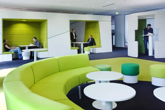
Let’s look at Sberbank, a large bank chain in Russia. Acrylic separation panels, wall paint, wall paper, lamps, teller pods, benches, chairs, pull up banners: all Greenery Green. It’s like shrinking down to the size of a bug and hanging out in a newly unfurled fern frond.
What about , out of Santa Rosa, CA? They recently rolled out a company rebrand, embracing the Greenery Green trend, as well. Their new brand focuses on the word “love,” paired with a Greenery Green palette. Utilizing the Pantone Color of the Year seems quite appropriate in this scenario – not many FIs have the name of a plant in their company name.
I visited Retail Design Blog (which happens to use Greenery Green in its own brand) to browse some other FI rebranding, and found heaps more Greenery Green. Let’s travel from Santa Rosa over to the East Coast and see what is happening there:
Generations Bank out of Seneca, NY has redesigned their corporate office and applied a moodier take on Greenery Green. Warm charcoal and taupe offset the pep of Greenery Green. This is a great example of how The Pantone Color of the Year can be used in a conservative, subtle manner.
Bank of Georgetown, located in Washington D.C., has embraced Greenery Green with their retail redesign. I don’t think you could find a brighter shade of Greenery Green paint if you tried.
Using the Color Green in Credit Union and Bank Branding
I am seeing Greenery Green all over the place. Recently, credit unions large and small have been unveiling logo redesigns; it seems like these things come in waves. Tiny Options Credit Union (formerly Legal Community), out of Denver, CO, did a massive brand overhaul, ditching royal blue and embracing Greenery Green.
LCCU, formerly Lewis Clark CU, out of Lewiston, ID, made a similar change. They too ditched royal blue in favor of Greenery Green. And wouldn’t you know it, they even used a leaf in their new logo.
Community 1st FCU in Ottumwa, Iowa stayed somewhere in the middle with their rebrand, mixing both royal blue and Greenery Green. This is an interesting example of embracing trends, but not jumping in head first. Certainly a more conservative approach.
And now, I would like to end this article with an example of the most bombastic adoption of Greenery Green that I have seen thus far: Zuno Bank (now defunct), out of Vienna, Austria. Zuno is a fairly new bank that was founded in 2010, and you can tell they have a more modern slant than their peers. They have truly embraced Greenery Green to its fullest extent – from logo design, to retail aesthetic, to web. What a fascinating example of an FI utilizing the Pantone Color of the Year.
I hope this article provided you with insight on this 2017 color trend for financial institutions. I can bet that you will be noticing Greenery Green more yourself now, too. Have any examples? Share them with me!


