
Three Signs Your Logo and Visual Identity are Outdated

By Alicia Disantis, Owner and Chief Brand Strategist
Most all visual identities – like your logo, brand guidelines, and color palette, have an expiration date. There are very few examples of logos throughout history that have stood the test of time. Think Coca-Cola or IBM; these logos are logos which have remained entirely untouched since their inception. Chances are, your organization’s visual identity will need a refresh at some point – but how do you know when?
It can be very challenging to know when your logo and visual identity are outdated, especially if you are wrapped up in the day-to-day functions of managing a business or a marketing department. However, there are clues to look for which will tell you that your visual identity is no longer relevant. In Part 2 of our series on rebranding (read Part 1 here), we discuss how to identify if your logo and visual identity features a trend that is now outdated.
Trends come and go, and if your visual identity and logo leaned heavily into one specific trend, you’ll need to be extra mindful of when that trend fades. Now, there is nothing wrong with embracing trends to stay relevant and chic, but the downside is that you have to update your identity more often. A good rule of thumb is that most trends last 3 to 5 years, including color fads, specific fonts, symbols, and visual applications (like, shadow, gradient, and shapes).
Why Updating Your Logo and Visual Identity is Important
Never underestimate the power of a contemporary visual identity - and the damage that an outdated visual identity can do to your brand reputation. A modern brand represents an organization that is relevant, smart, and trustworthy, and is a significant reflection on your capabilities. Consumers feel that if a company is not capable of having a modern brand identity, then how are they going to be capable of providing you with the most effective services and products? Visual identities are distinctly tied to brand trust.
Think of it this way: you are looking for a realtor to sell your home. One realtor’s office has clunky laptop from 2010 and a blackberry phone. Another realtor’s office has a new, sleek computer model and phone. What is your first impression going to be of each realtor? A brand identity works in much the same way. An outdated brand dilutes trust and allow competitors to slide in, creating a disruptor experience for your hard-earned brand reputation.
Outdated Colors in Brands
Every year, Pantone releases a “color of the year,” which is chosen based on industry trends, cultural events, and the general socio-economic landscape of the year. Many visual identities are influenced by the Pantone Color of the Year each year, and these colors can act as a trend barometer.
For example, the Pantone 2017 Color of the Year was a bright grass green and heavily influenced logos and design around that time. If you see this color used in a logo, chances are it was created around a decade ago, and now is considered outdated. I wrote extensively about Greenery’s use in branding back in 2017 - you can read the article here.

Be sure to spend time every year following Pantone’s Color of the Year announcement and reading up on color trends. This Pantone color guide from House Beautiful provides a list of every Pantone Color of the Year since 2000. A quick review will certainly jog your memory back to that time, when specific colors saturated design and culture.
Let’s take a look at the green color from 2017. It was used heavily in design, from logos to interior decorating, but is now considered outdated and harsh.


Outdated Fonts in Brands
Just as color trends come and go, so do fonts. There are many “infamous” fonts that are widely considered untouchable at this point, because they have been so overused, like Comic Sans and Papyrus. However, there are some lesser-known fonts that were very popular but will now date your visual identity if still in use. One of which is Pacifico, a free font which was extremely popular a decade ago but now is heavily dated.


So, how do you know if your font is dated? First of all, you need to know which fonts are used in your visual identity. If you have a copy of your brand guidelines, be sure to research your fonts every year to make sure they are still relevant. If your designer didn’t provide a copy of your brand guidelines or font files, you can run your logo through a handy font checker, like Fontspring Matcherator.
Outdated Symbols in Brands
Symbolism in brand identities is a little less cut-and-dry than colors and fonts, but there are very specific symbols that will instantly date your brand if currently in use. Many of these are tied to cheap clip art and stock logos from the time and are a dead giveaway that your brand was created on the cheap and lacks depth. Let’s take a look at a few common examples:
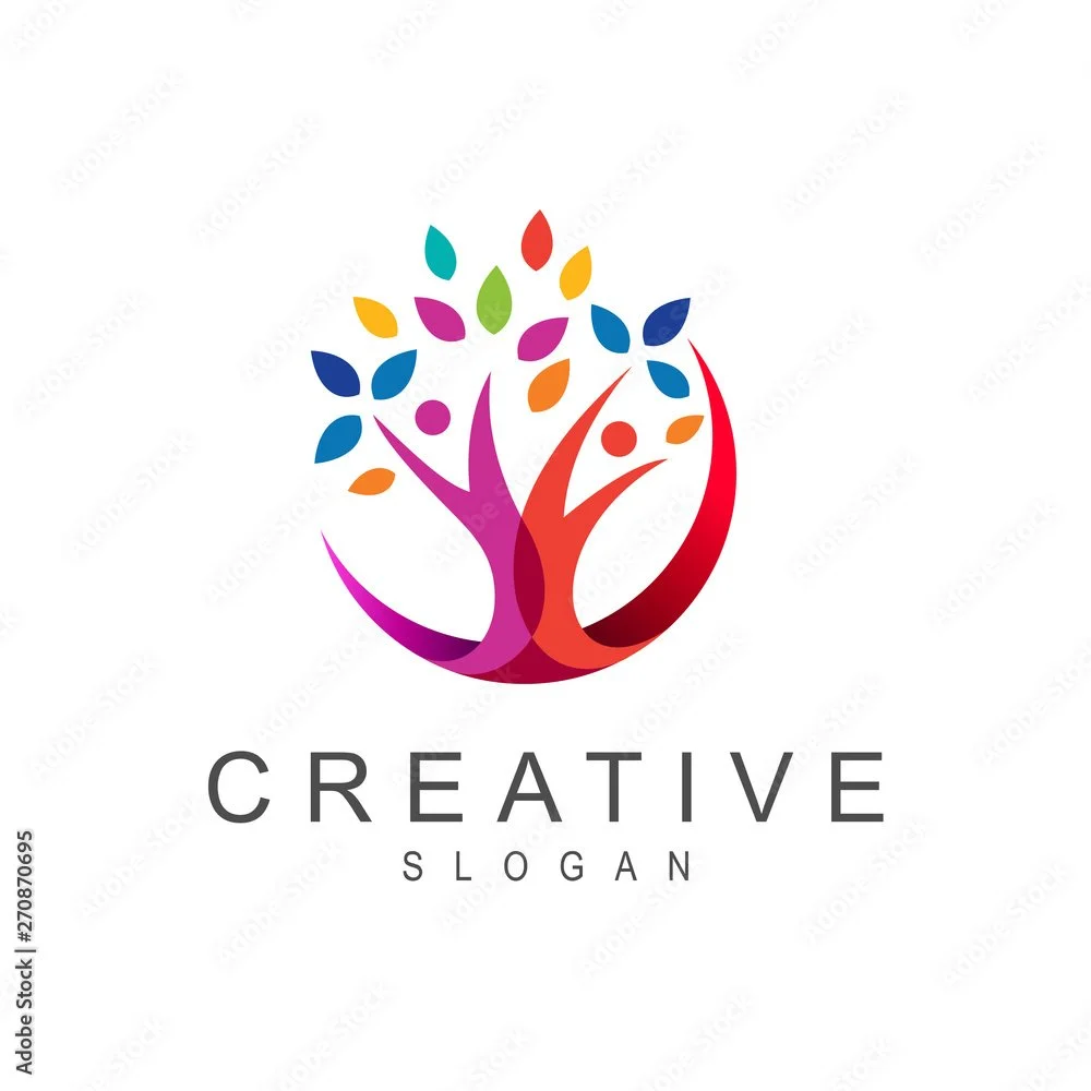
1. Festive Tree
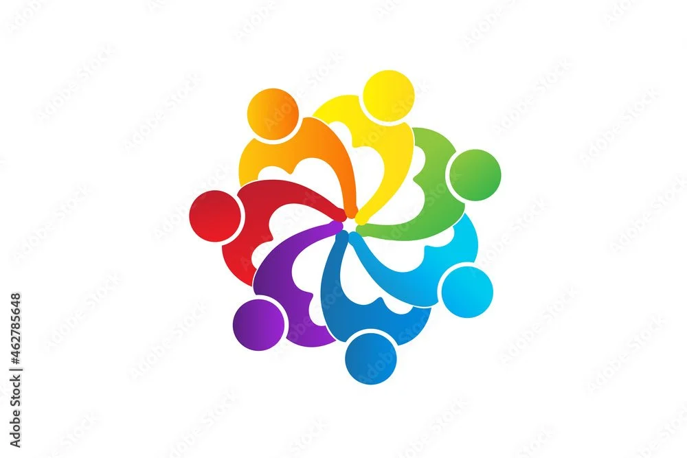
2. hands in a circle
3. wheels and cogs

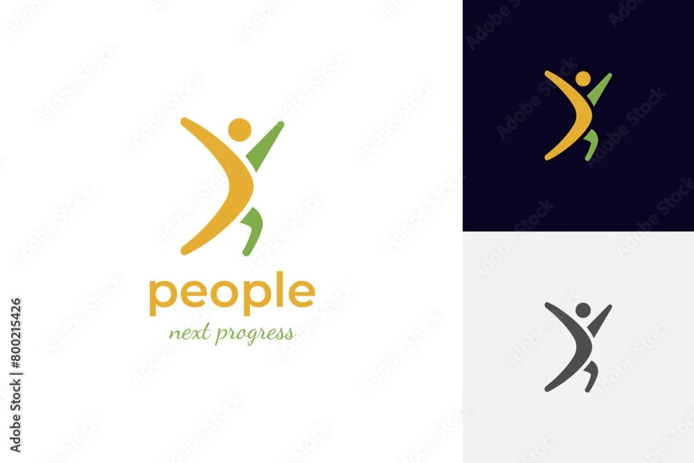
4. Dynamic human movement
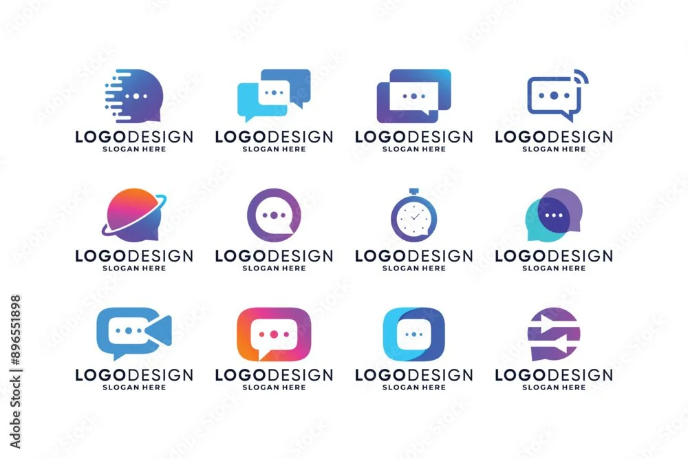
5. Chat bubbles
It’s important to conduct an audit of your visual identity and marketing collateral every year to make sure all of your elements are up to date and do not include tired stock imagery and symbolism. Consult a brand agency like 38th & Kip or a trust group of advisors outside of your organization for real, honest feedback.
This article by Vista Print is a resource to browse outdated logos and get you thinking about the symbolism in your own organization’s logo.
I hope you found this article on outdated logo and visual identity trends helpful in recognizing when it’s time to rebrand. Color, font, and symbolism all play an important role in the modernity of your brand and it’s critical to arm yourself with basic knowledge to protect your brand’s reputation.


