Aux Rebrand
Aux is one of the largest credit union service providers (CUSOs), helping credit unions with fractional back office functions.
Brief: Well before the COVID-19 pandemic hit, 2020 brought tremendous change to national B2B financial services organization CU Service Network. It was decided in early January 2020 that the company was to split into two and create an offshoot company for its original core product line. The logo and brand were already terribly outdated, so this split was a much-needed catalyst to finally rebrand.
Over the past five years, the organization had launched and found success with outsourced services for credit unions, principally accounting, compliance, and data analytics. The organization would step in and act as an extension of the credit union’s team, assisting in cost, staffing, efficiency and back up. It made sense for the new brand to reflect this unique offering in the market.
Challenge: Firstly, creating a vibrant brand in a saturated market, one worthy of the company-saving work the organization does, and secondly, a brand that provided the company with an opportunity to tell their colorful story. In addition, the brand needed to be flexible enough to incorporate the myriad of new services and partnership opportunities that the future held.
Disiplines
Brand Strategy
Company Naming
Tagline
Brand Narrative
Brand Voice
Visual Identity
Website Design
Event Design
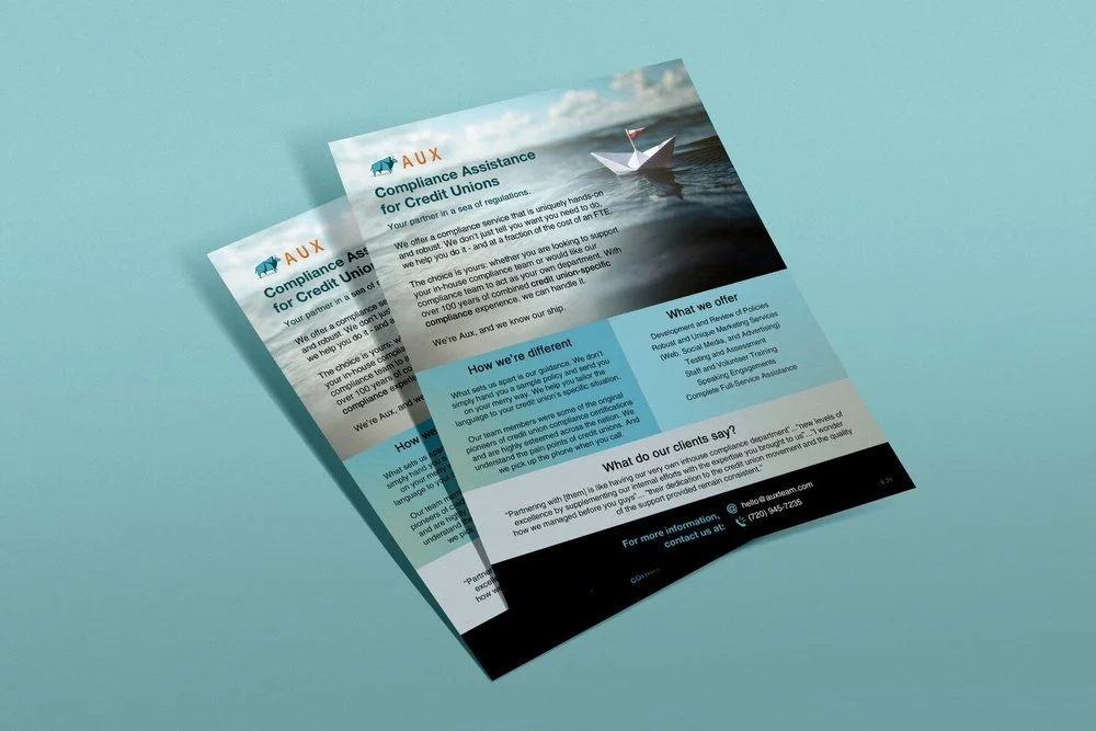
Sales Collateral
Aux Logo and Tagline
“I worked with Alicia [Owner] for over two years at Aux (FKA CU Service Network). Alicia was instrumental to our re-branding effort. She designed and implemented the re-branding effort for both companies under the Aux umbrella. She was budget conscious, while consistently looking for new and inventive ways to bring the Aux brand to life. She was a joy to work with.”
Solution: Aux: Doing the Hard Work for You. The name Aux comes from auxiliary, meaning additional help and support, which is exactly what the organization does through outsourced services. Phonetically, the name sounds like ox, so an origami ox was incorporated - which also symbolizes the ability to make something special out of little resources (which so many credit unions have), and is also a known financial symbol of strength and stability.
The mark stands on its own, both with and without text accompaniment. It also lends itself to badges, stickers, pins and other swag.
The tagline is another critical component, which ties the ox imagery to the Aux brand: DOING THE HARD WORK FOR YOU. Combined with the term Aux Team, which the employees and partners are known as, it creates a sense of comradery and purpose. The age-old credit union mantra of “people helping people,” is incorporated: Aux are the people who help the people who help the people.
This multi-faceted brand provides a rare opportunity for the team to tell their story in a deep and powerful way, in an era when few people have the patience to listen.


![[Video] The Importance of Personal Branding and Style](https://images.squarespace-cdn.com/content/v1/520554d2e4b004c7f36bec69/1763501803563-Z9ETS8FKI0MHAGDHVIQS/personal+branding.jpg)
